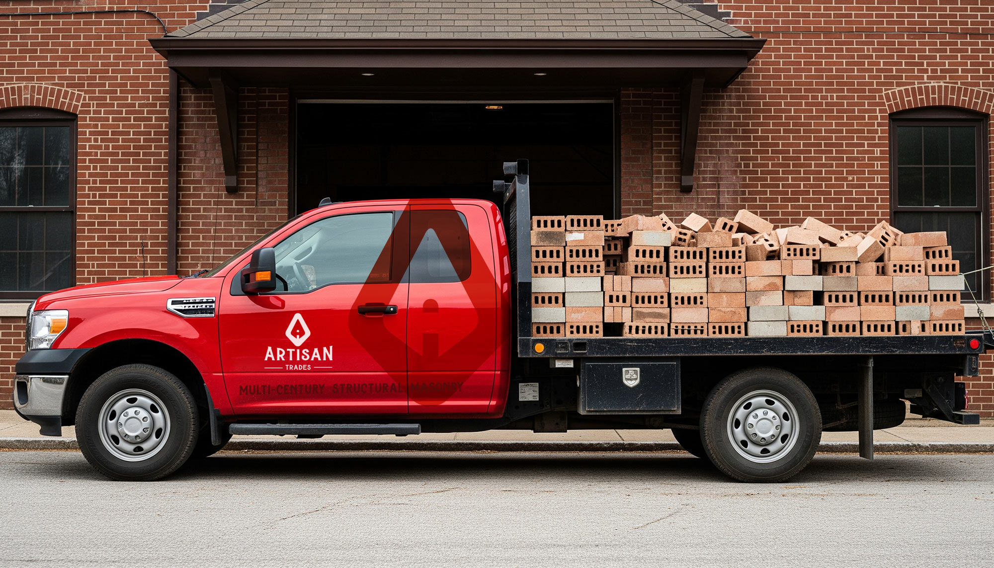
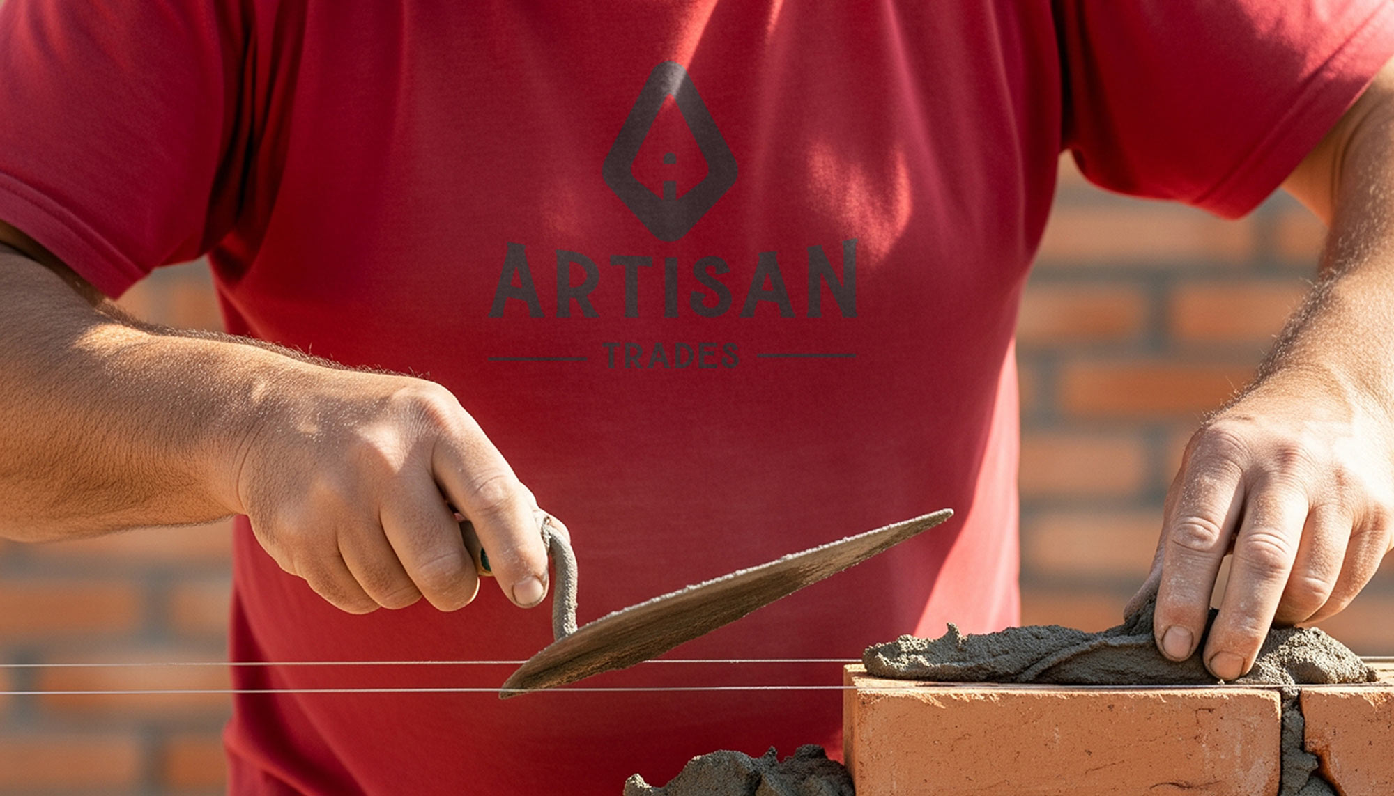
Developing the brand identity for Artisan Trades was an exercise in capturing the essence of enduring quality and skilled craftsmanship that stands the test of time. As a structural masonry company, their work forms the very foundation of buildings, demanding a brand that communicates reliability and artistry. Our core focus was the logo design, which ingeniously integrates the initial “A” of Artisan Trades with the iconic shape of a mason’s trowel. This symbol isn’t just a clever visual; it directly speaks to the precision, dedication, and hands-on expertise that defines their trade. Paired with this, we developed a rustic custom type treatment that lends an authentic, time-honored feel, evoking the heritage and skill passed down through generations of masons.
The complete brand package for Artisan Trades is a testament to their commitment to excellence. Beyond the logo, we established a visual language that balances robustness with refinement. The color palette reflects the natural tones of stone and mortar, grounding the brand in the materials they master. Every element, from the typography to potential imagery, was designed to convey the strength, integrity, and beauty inherent in structural masonry. This branding ensures Artisan Trades stands out as a company that not only builds structures but also lays the groundwork for lasting trust and quality.
