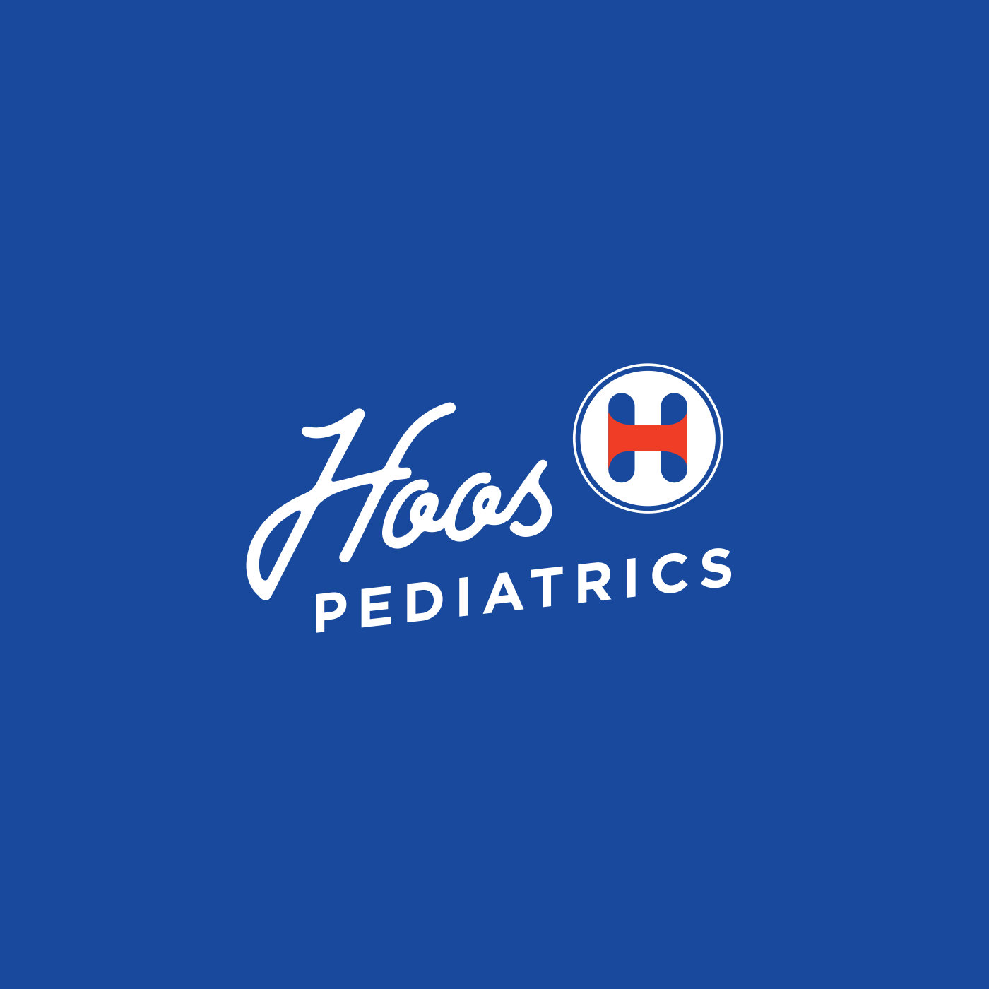

Crafting the brand for Hoos Pediatrics was about more than just aesthetics; it was about creating a welcoming and reassuring environment for children and their parents. Our primary goal was to develop a brand identity that communicated compassion, expertise, and a child-friendly approach. The cornerstone of this brand is the cleverly designed logo, where a comforting bandage icon seamlessly forms the letter “H” for Hoos. This visual immediately conveys care and healing, essential qualities for a pediatric practice, while also being memorable and unique.
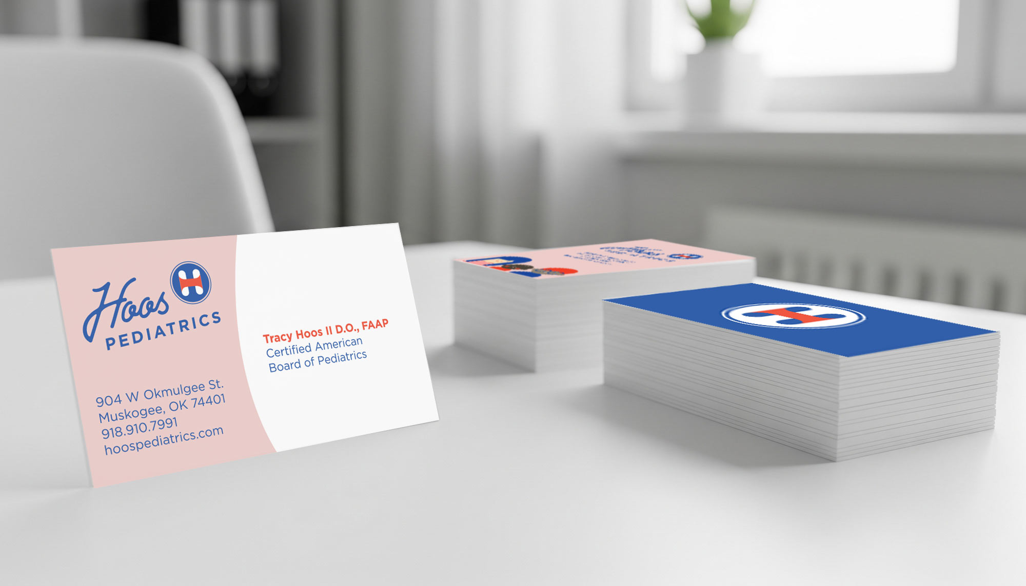
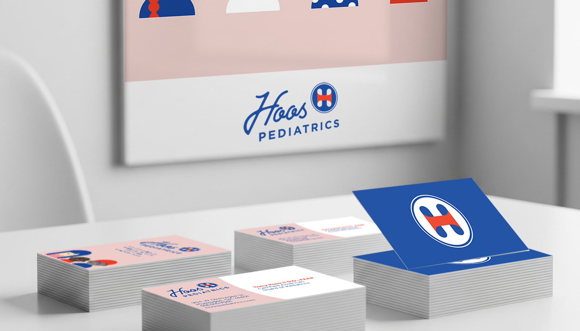
Beyond the logo, we extended the brand’s cheerful and supportive personality through a series of custom-designed iconography. These playful yet sophisticated illustrations are versatile, intended for use as engaging wall decor within the clinic to soothe young patients, and across promotional materials to reinforce the brand’s approachable nature. The brand execution also included essential collateral such as appointment cards and business cards, ensuring every touchpoint felt consistent and professional. To maintain this cohesive experience, we developed a comprehensive brand standards manual, providing guidelines for everything from color usage and typography to imagery, guaranteeing that the caring ethos of Hoos Pediatrics shines through in every interaction.